When Teacher Zhang visited our factory to help with planning, he was surprised to find that the crucial step of creating the artwork for our complex, multi-colored gradient wash care labels was being handled by an external publishing company. He strongly advised us to master this core technology in-house.
Coincidentally, my computer was infested by cockroaches around that time and had to be sent for repairs. With my blog updates temporarily on hold, I decided to use this downtime to calm my mind and learn the new skill.
I asked the owner of the publishing company—a partner we’ve worked with for over a decade—to be my mentor. He was initially reluctant to accept tuition fees, but I insisted for two reasons:
- Without paying a proper fee, I wouldn’t take the learning process seriously and would never truly master the skill.
- No one is obligated to teach you anything for free; paying a fee ensures the teacher remains dedicated and responsible.
Upon hearing these reasons, he found it hard to refuse and accepted the payment on the spot.
Since I already had a foundation in using design software, my mentor didn’t find it too difficult to teach me. After listening to nearly two hours of theory on the fundamentals of artwork creation, I realized that the “halftone dot” technique—which had always intimidated us—wasn’t actually that hard to execute. The real challenge lies in achieving high success rates and quality results, which requires practical, hands-on experience. I don’t mind admitting that I even used Pinyin for many words in my notes.
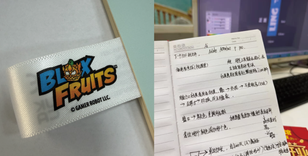
Practical work began this morning as I attempted to create a multi-colored gradient wash care label file on my own. I encountered several tricky details along the way—such as how to delete unnecessary nodes when adjusting the gradient.
I messaged my mentor for advice while working, and he was very prompt in his replies.
There is another crucial aspect to creating the artwork: to prevent misalignment between layers—which could result in unsightly white gaps—specific areas need to be thickened or slightly inset.
I wasn’t sure which layer to work on or which tool to use for this step.
I grabbed my car keys and headed straight to my mentor.
I demonstrated my entire workflow—a vital step—and he corrected several of my improper methods. He explained that I shouldn’t drag individual elements out separately, as that leads to imprecise alignment later on.
After resolving all these issues, I went back and redid the entire process, applying exactly what my mentor had taught me.
As for the wash care label design I created,, we won’t know if it can truly replicate the visual effect shown in the client’s mockup until it actually runs on the printing press—I’m really looking forward to seeing the result.
Even a seasoned technician with exceptional expertise in halftone dot reproduction cannot guarantee a perfect print on the very first attempt.
For multicolored care labels with gradients,, the screen artwork is crucial. Ultimately, however, it takes a skilled veteran printer—one with a keen eye for color—to mix the right hues and achieve the desired visual impact. Not just any label printing factory possesses the capabilities required for both of these aspects.
When it comes to highly complex wash care labels, we currently only possess the latter capability. We cannot afford to neglect mastering this technology simply because we are currently benefiting from excellent external collaboration. We must achieve internal mastery first; only then can we effectively manage quality and continue to push boundaries.
If you’ve been dissatisfied with the care labels you’ve received elsewhere, you should give Ruan Qiuyue printed Label Factory a try.