Who I Am, and Why I’m Writing This
I’m Ruan Qiuyue — a second-generation owner of a woven care label factory. Care labels (also called wash labels or garment tags) are the small labels sewn into garments, plush toys, and other textiles, indicating fabric composition and washing instructions. When fellow label makers encounter color printing jobs they can’t handle, they often shake their heads. I’d rather dig in and figure it out. This is my 227th industry practice journal, and today’s topic has just one focus: how to get halftone “color overprinting” right on full-color satin care labels.
Why Pre-Press Is Non-Negotiable for Color Care Labels
No matter how simple or complex the design, every care label must go through pre-press, plate making, and then printing. This is an ironclad workflow, not an option. Satin care labels are the ideal playground for flexographic (flexo) printing, because satin comes in many base colors and demands high resolution — few other printing methods can handle both. When a design involves more than five or six colors, 95% of the job is done in pre-press, through a technique called “halftone color overprinting”: using a single ink color, but varying the halftone dot percentage (screen value) to achieve different brightness levels.
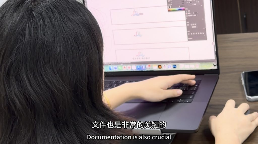
The catch? The very labels that need halftone overprinting are among the most difficult in flexo printing. And honestly, my hands-on experience in this area was almost a blank slate — until today.
Case Study: The “Panda Face” Seven-Color Satin Care Label
Today’s practice piece is a satin care label I call “Panda Face.” The design has seven colors in total. The face and the eye sockets use the same ink color at different brightness levels — a textbook halftone overprinting scenario.
The core question was simple: what screen value will make the final print match the customer’s mockup?
My First Screen Value Plan
I made plates based on standard computer color separation: eye sockets at 100%, face at 20%. Honestly, I had my doubts — if computer separation alone could nail it, we’d just dial in the parameters every time. I suspected it wouldn’t be that easy.
Worried that 20% would be too dark, I made a backup plate at 8%. But I also worried that 8% might show visible halftone dots that the customer wouldn’t accept.
There was also an English text section in two shades of rose red from the same color family. For the lighter shade, I set it at 88% — this one I felt fairly confident about, so I only made one plate.
On Press: Computer Separation ≠ Print Result
Once the plates arrived, I asked the press operator to run the 20% plate first — specifically to test whether computer color separation was really that accurate. The verdict came quickly:
• 20%: failed immediately. The color was far too dark, nowhere near the mockup.
• 8%: surprisingly close to the artwork, with fine, subtle dots — nowhere near as visible as black halftone dots tend to be.
• Rose red pair: printed at 100% vs. 88%, the difference was nearly invisible to anyone but a trained eye.
Trial Adjustment: How Much Can Pressure and Ink Save?
I discussed with the operator: reduce plate pressure slightly, cut back the ink. After adjustments, the brightness did drop — but the adjustable range was tiny. It couldn’t rescue an error of the magnitude of the 20% plate.
My Conclusion
When using halftone dots to stretch one ink color across light and dark tones, the screen values need to differ by at least 25% for the difference to be easily visible. Differences within 20% (e.g., 100% vs. 88%) are practically invisible to end consumers — so there’s no need to chase this kind of “false precision” in pre-press.
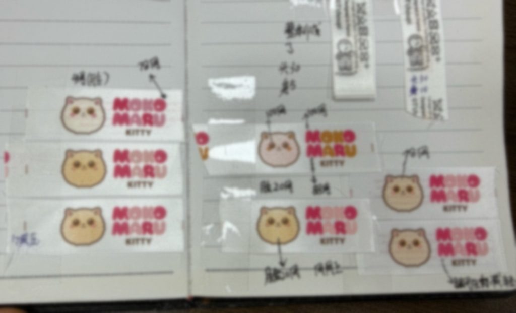
After the customer received the sample, they had just one request: the face should be even lighter. This time I switched to a 4% screen value. They didn’t mention the rose red, but I made an extra plate at 75% anyway and ran it myself — building up my reference material.
I collect every printed sample carefully, pasting them into my notebook with detailed notes. My colleagues’ samples get organized the same way.
If you want to master an industry, the best way is to keep practicing, summarizing, and improving — stay observant, and one day you’ll become the expert.
For care labels that others can’t or won’t do well — give Ruan Qiuyue a try.
———————
If you would like to know more about Ruan Qiuyue, you can follow her Facebook account